 Pick of The Week

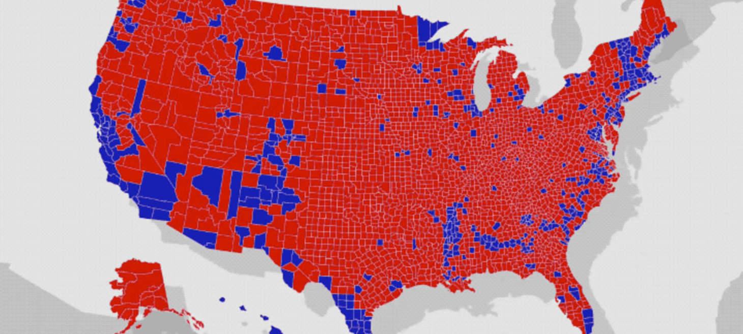
U.S. election maps are wildly misleading, so this designer fixed them
Careful how you read data...
When done right, data viz can be very powerful, but when done poorly it can mislead by quite a lot....by how much you ask? Take a look at this seemingly simple electoral map from 2016 that's still making waves today.
 The Best of The Rest

MultiAdaptor’s identity for YouTube Space uses the playbar as a visual thread
From a UI component to an entire identity.
Taking inspiration from one of the platform's most recognisable UI components, a London-based design studio shares how they gave YouTube Space an identity that feels more dynamic and modern than its siblings.

Why Google’s new app logos are pretty (&) bad
Some constructive criticism.
From the lack of recognisability, and overkill 'consistency', someone from the UX community outlines some surprisingly solid reasons why Google's new Workspace logos might have broken one rule too many.

Soviet design
Design in the Soviet Union era.
From their serious, pragmatic approach to design, and infamous propaganda graphics, the Soviet Union's influence in Graphic Design can't be understated, so here's a history lesson for the curious out there.

How to Send a Follow-Up Email After No Response From Your Clients
For when things get awkwardly quiet.
Getting ghosted by clients in the midst of (or after) a project is far from ideal, and if you're still wondering how to follow-up a second time, fear not! There's a guide for that too.😉
 One More Thing

Sheppard's Kaleidoscope Eyes Album Design
I can't believe it's not...
3D rendering technology has come a crazy long way, but despite the look, this isn't about CG, but a quick behind the scenes of a beautiful album design made entirely with real-world objects, yes all hand-made folks!
