 Pick of The Week

5 things that are killing your landing page
Enough with all the CTAs!
When rushing to design a landing page, we often fall victim of overused conventions, so if you've been missing the mark lately, here's a good reminder of things you might want to avoid on the next round.
 The Best of The Rest

Shneiderman’s Eight Golden Rules...
Rules for frustration-free UIs.
What makes your favourite app so 'great'? the animations? the navigation? the Giphy integration? Whatever it is, the design behind it came with some key rules, and now you'll get to know them too.

Create Your Personal Branding Strategy in 4 Simple Steps
"Don’t be afraid to be a little polarizing".
From the increase in project rates, to better visibility with clients you'd actually care about, there's a handful of benefits to crafting a personal brand that's true to you. So maybe it's time to say hi to the new/improved you?

Templo’s branding for the UK Anti-Corruption Coalition plays on cryptic typography and distortion
An identity inspired by corruption.
When presented to the world of corruption in the British financial and political world, creative director at Templo decided it was time to embrace its cryptic aesthetic, and roll with it.

Inline Menu Layout with Gallery Panel
Hover effects for the photo lovers.
Ever wonder how to create those slick hover effects with appearing imagery on menu items? Well skip the guesswork, 'cause another Codrops demo is in. (Project file included)
 One More Thing

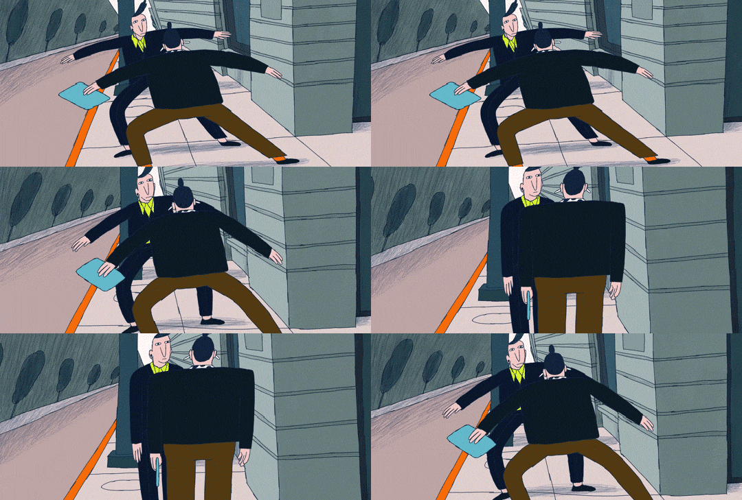
'Awkward' is a funny animation that reminds us of the most embarrassing moments in life ....
Just act cool...
From never knowing when to hug or give a handshake, to bumping into people in the streets, socially awkward moments are universal, and this artist managed to bring them all to life in an awesome short. (You WILL feel the cringe.)
